Open Sesame
13 Oct 2014
When guests visit, treasure should be the first thing they see—just like Ali Baba when he opened the cave where the 40 thieves had stashed their loot.
Here are tips to make any entryway sparkle.
By Ruthanne Johnson When people decorate their home, they typically think on a grand scale—living room, kitchen, bedrooms, family room, bathrooms, and maybe even outdoor spaces. But the often forgotten foyer plays an important role in setting the tone for your entire house. So what does your entryway say? Is it welcoming and comfortable? Or is it cluttered and crowded?
When there’s space available, entryways should be treated and furnished in a way that makes them special little rooms.
“It’s the first space your guests experience,” says Denver interior designer Sarita Krishnamurthy with IN.De Interior Architecture and Design. “Therefore, it should make an impact, and be a reflection of your home’s style.”
If you usually enter your house through a mudroom or garage door, you may not realize that your main entry says nothing, or worse yet, says terrible things about you or your home, says designer Jennifer Jelinek, owner of JJ Interiors in Denver. “Come in through the front door once a month and take note of your surroundings,” she suggests.
Because entryways are typically one of the home’s smallest rooms, a makeover shouldn’t require a great investment of time or money. Just make sure the space is low maintenance and easy to keep in top form. Start by touching up chipped paint, sweeping the floor and changing burned-out light bulbs.
With a little TLC, you can freshen up your foyer and create cohesion with the rest of the house. You’ll give clutter a place to live, and your guests will leave with a positive impression.
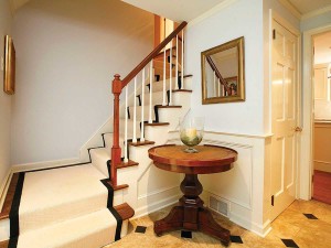
- The black tiles in this entry coordinate with the carpeting to provide interest. The round table gives the homeowners a place to set things when they enter.
Sketch It Out
When rethinking your entryway, Denise Pfau Demby of Creative Arts Design Center in Wheat Ridge recommends first listing the areas that need improvement from a functional standpoint. “Do you bump the walls when you come in?” she says. “Do you have shoes and coats all over the place because there are no hooks or a closet? Is the entryway dark and uninviting?” Collect magazine and online images of foyers you like. “You’ll begin to see how different designers have addressed color, space planning and lighting,” Krishnamurthy says, “and you’ll get a sense of how these elements can work together in your entryway.” It’s also good to find that one special item you connect with to bring your personality to the room, Jelinek says. It could be a great lighting fixture, a statement rug, or an interesting piece of art. Next, make a plan and write it down. “Use graph paper to sketch the space, and make a list of things you need to do or get.” And don’t be afraid to try something new. “Even professional designers often go through many options before finding the right combination to complete a room,” Jelinek says.Set the Mood
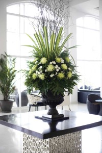
To create an inviting space that welcomes guests, Jelinek suggests considering how you want the space to feel: bright and playful, elegant and classic, or colorful and modern? For small entries, keep the area bright with minimal décor. For large entries, which can feel cold and cavernous, “add furniture, artwork, and a beautiful center table with flowers to fill the void.” If your entry opens to another room, think about how both spaces work together. A partition can help with privacy, while unique architectural elements can enhance what’s already there. Krishnamurthy used an archway to create a distinct separation between the entry and the dining room in one client’s home. An all-time favorite entryway of -Demby’s was an old Victorian home she once visited in Denver. “It had a fireplace and a bench right at the front door so you could warm up when you came in.”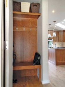
- An entry should be functional, as well as welcoming. This tiny entry has a place to hang coats and a bench to sit on to remove shoes.
Think Function
Focus on functionality and convenience for you and your guests. Any main point of entry for homeowners should have storage for keys, mail, sunglasses, bags, and even the dog’s leash. A drawer in a console table is discreet, while a closet or coat rack provides places to hang your hat and outerwear. For many of her “shoe-free” clients, Krishnamurthy likes to add seating for guests removing and putting on their shoes, and some sort of storage to conceal footwear, like baskets beneath a bench. Also, consider flooring materials that can handle moisture and temperature changes. Because entryways are the transition between outside and inside, Demby suggests a landing space and enough room for a group of people to enter the house.Catch the Eye
Whether it’s a lighting fixture, a piece of furniture, a mirror or artwork, every entry should have a focal point. “Your eye should be drawn toward it and then taken into the house,” Krishnamurthy says. The focal point needs a specific element or two, such as a bench with a mirror or artwork above it, or seating that flanks a console table. Jelinek remembers one homeowner in desperate need of entry improvements. “The bones of the entry were nice, though neglected,” she says. “The door handle wasn’t functioning properly, the art niche adjacent to the door was empty, the overhead light fixture had an awful glare, and the wall sconce had been removed, leaving exposed wiring to greet you at the door.” After replacing the door handle and lighting fixtures, she and the client found a sculpture at a local art fair that fit perfectly into the niche. Jelinek also framed and hung a watercolor painting that the couple had acquired on a trip to Peru, and placed a rustic reclaimed bench near the stairs for a finished look. “Now it’s a simple, understated entry that invites you to come in and stay a while.”
- This stunning entry is a complete extension to the outdoors. “Flooring, wall sconces and railings were purposely kept minimalist, so as not to compete with nature’s beauty but rather complement it,” says designer Jennifer Jelinek.
Create Cohesion
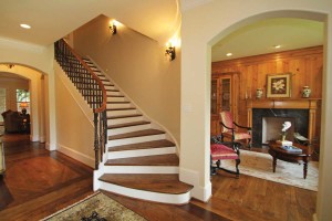
For continuity, keep the home’s overall décor in mind. An entry Jelinek worked on provides an example: “The entry was large and visible from many areas of the home, with views directly outside as you stepped in,” she remembers, “so we had to look at it from all angles.” Artwork on each side of the door presented a framing effect that could be seen from other areas of the house and by guests as they were leaving. Benches with storage underneath provided a place to sit, and a custom-designed front door and eye-catching ceiling fixtures created a great impression. “Flooring, wall sconces and railings were purposely kept minimalist, so as not to compete with nature’s beauty but rather complement it.” Evaluate your entry’s layout to determine the potential for new uses. For example, the space beneath a large, winding staircase could become a cozy oasis by adding a comfy chair and a floor lamp, or a place for sorting mail and paying bills with the addition of a small desk. A niche could display collectible art.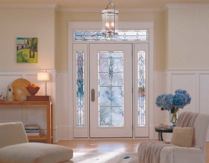
- The glass door gives this entry natural light, while the furnishings, flowers and artwork add warmth.

