Paint Tones: tips to add bold hues to your home

03 Apr 2019

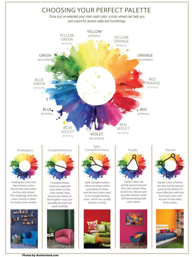
Stuck in a white rut? Here are tips to add bold hues to your home.

By Carol Brock
BEFORE
The word ‘coral’ may conjure up images of colorful reefs beneath a glittering sea. But coral is also the term for a rich, reddish-pinkish orange, and “Living Coral” is the official Pantone 2019 Color of the Year. Described as an “animating and life-affirming shade of orange with a golden undertone,” Pantone’s Living Coral is bound to appear on walls across the country. For many, though, dazzling corals beneath the waves might be easier to imagine than vibrant coral on their walls. Embracing color in the home is often difficult, especially because unobtrusive lighter tones never vie for attention and seamlessly blend with any furnishings. Yet, color has the ability to lift your mood, brighten your space and add a warm dimension to your environment. It can make rooms feel larger, smaller, more formal or informal, and can accentuate architectural features. Dark paint can make a cavernous room feel intimate, while smaller spaces sizzle when an accent wall is splashed in a saturated hue. Here are ideas to help you welcome color into your home. “First, look at images in magazines, catalogs and online to see which colors you’re drawn to and which ones you don’t like,” says Paul Cristofani of Louisville’s Juniper Paints. Commercial establishments often use bold colors; he suggests checking out colored walls in the storefronts and restaurants you patronize.
This black office with white trim is “a crisp, classic combo,” says color consultant Michelle Marceny of The Color Concierge in Boulder. “Black especially goes really well with wood.” (Photos Courtesy the Color Concierge)
When you’re ready to take the paint plunge, pick a favorite color from your room’s décor, whether it’s in a pillow, artwork, a rug or whatever, and use it as an accent on one wall while keeping the other walls neutral, suggests color consultant Michelle Marceny, owner of The Color Concierge in Boulder. “If it’s an open area, like a great room or a foyer, I like to keep the colors neutral, calm and serene, and then use more vivid colors in rooms that connect off of common areas. Side rooms in vivid colors are not as overwhelming,” she explains. She also scrutinizes a room’s hard finishes. “Hard finishes are a great place to start when picking colors,” Marceny says. If your living room has a stone fireplace, pull a color out of the stone. In a kitchen or bathroom, look at the countertops, the cabinets and the tile, and pick a color from those for your paint. “Compatible colors to the hard finishes create a more harmonious look,” Marceny says. For example, “Cararra marble has blue-gray undertones, so I would choose a cooler tone, like a light blue-gray, a dark blue, or a green for a room with that type of marble in it.” Some interior designers preach against too many matching items in a room, but “I think matchy-matchy looks awesome,” Marceny says. “Pull the really pretty gray out for your walls if that color is in your marble. It all goes really well together.”
This home’s “tangled up in blue” color scheme is at once pleasing and calming. (photo by photographee.eu)
When selecting bolder paint colors, you should still stick with the palette in your hard finishes, she says. Find the finish color you like on the color wheel, and then pick the color opposite it on the wheel. You can also use a color wheel to create different palettes for a room, such as monochromatic, analogous, contrasting and complementary. Monochromatic uses several shades of a single hue; analogous uses colors that are side by side on the wheel; contrasting incorporates evenly spaced hues on the wheel; and complementary uses hues that are opposite on the wheel. Black and white is always “a crisp, classic combo,” Marceny says. “Black especially goes really well with wood.” To narrow your paint choices, take a photo of your room and upload it to paint-store websites, like Benjamin Moore or Glidden Paint. These sites allow you to change a room’s colors to easily visualize the result.

Look In Your Closet

Still feeling daunted? Look at your favorite wardrobe pieces, suggests interior designer Barbee James, owner of Details Design Studio in Boulder. “I’ve found most clients feel better if their home reflects their personal color palette.” Most people’s color preferences fall into the seasonal palettes of winter, spring, summer or fall, or a combination, she says. Based on the book, Color Me Beautiful, seasonal palettes complement a person’s skin tones to bring out their natural beauty.
A lime accent wall accentuates the green in this room’s vertical living wall, houseplants and couch accessories. Gray and wood accents add depth. (photo by photographee.eu)
For example, autumn people look best in rich, warm fall colors: orange, red, gold and bronze. Spring people look good in vibrant colors like yellow, pink, peach and purple, while a winter person’s palette consists of cool, icy tones like white, royal blue and black. Summer people sparkle in pastel greens, blues and pinks. James recommends that clients paint their homes in colors they personally look and feel best wearing. “I’ve found my clients tend to be happier in their environment for a longer time if they do so,” she says. When looking for an accent wall color, look at the art and the fabric colors in your home and then look in your closet to see what colors you wear, she says. Once you select a color, you’ll need to see it in all lighting situations: daylight, nightlight and LED light. James recommends the 2700 LED light spectrum because it offers a softer light. Home-improvement stores carry a product called “SureSwatch,” which is a paintable clear film that comes in different sizes that you can adhere to multiple walls. “It leaves no residue, and you can take it from room to room to see what your potential accent color looks like next to your furnishings and in all lighting situations,” James says. Who knows? Living Coral may be just the ticket for your accent wall. “This new color is a wonderful choice, as it goes with everything, including the gray trend, and will give longevity to the coolness of gray,” James says, adding that coral is often the color in Colorado sunrises and sunsets. “How exciting that this color from nature is our new Pantone Color of the Year!”  
Prev Post 6 Ways to Repurpose China
Next Post Meet artist Russ Wright
Browns Shoe Fit
Wild Animal Sanctuary