Patterns, Patterns Everywhere

21 Jul 2020

How to be big, bold and beautiful when designing with patterns

By Ruthanne Johnson
  Have you ever walked into a home that had a crazy mix of patterns in the décor: circles and stripes, paisleys and polka dots, triangles, florals, zigzags, and octagons? Perhaps the effect was an eye-jarring hodgepodge that made you want to run to the nearest white room. Or maybe the patterns somehow worked, making you feel like melting into the sofa with a good book. When arranged purposefully, patterns enhance a home, says interior designer Helly Duncan with Louisville’s Design Matters Home. “They tie together colors, shapes and textures to create a beautiful cohesion that makes the space interesting and inspiring.” Flat and solid finishes and furnishings typically blend together so that nothing draws your attention. “Patterns give your eye somewhere to pause and take notice,” says Boulder interior designer Jennifer Rhode. Unexpected pattern pieces then become pleasant surprises in the décor. When not chosen carefully, though, patterns can make a room feel jumbled and frantic. “The most common mistakes are either overdoing or underdoing patterns in a space,” Rhode says. “Therefore, balance is essential.” A great starting point is to honor your personal preferences, suggests Denver interior designer Erika Rundiks. “That could mean a certain color or pattern, or a piece of furniture or art, and you build from there.” Rundiks typically begins by walking through a home with clients to discuss color and cultural preferences, like art from travels or furnishings from afar. “It’s fun to make those things you love a focal point in your design,” she says. To help get your pattern ball rolling, we asked these pros to explain their approaches to adding, mixing and matching patterns in the home using photos of their projects as examples. Build on their advice, and go bold!  
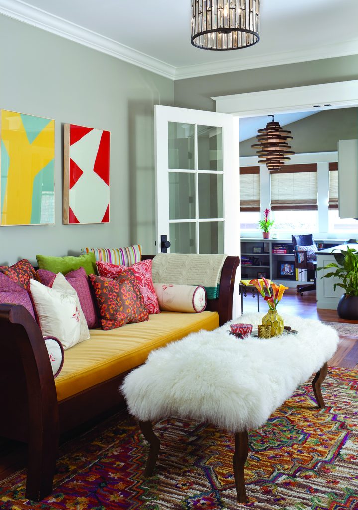
Photo by Emily Minton Redfield, emredfieldphotography.com
The traditional rug drives this sitting area, but it was “so busy it called for a solid couch,” says Rundiks, who collaborated on all her designs with Katie Schroeder of Denver’s Atelier Interior Design. The modern and bold art juxtapose against the rug’s Old-World pattern and more traditional pillows. The sheepskin table cover adds texture and is traditional yet modern looking, which ties in with the wall art.  
Photo by Susie Brenner, SBrennerPhoto.com
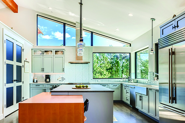
In this design, simple contemporary cabinets allow for a bold tile backsplash. The ceiling wallpaper gives a nod to the backsplash, as do the chairs, even as they contrast with the darker tones. “The different shapes, styles and colors communicate with each other,” which is essential when integrating patterns, Rundiks says. The lines in the cabinet grain, floor patterns and ceiling wallpaper lead the eye to a convergence point over the kitchen sink and the curved, ­dark-blue light fixture.  
Photo by Kimberly Gavin Photography, kgavinphotography.com
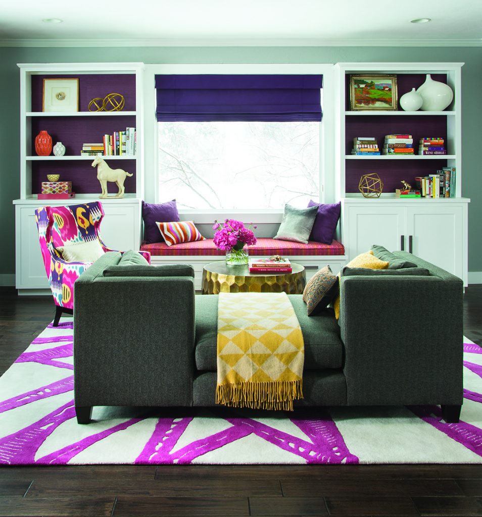
This fun but classic living space is a prime example of how pink and purple support each other. “They are such sexy colors,” Rundiks says, “and who doesn’t look good in purple?” Purple grass-cloth backing in the bookshelves gives the room texture and depth, while the built-in window seat provides a color anchor. The rug’s contemporary pink ikat pattern is simple and open. The lounge chair, on the other hand, is bold and fun. The yellow blanket is a shining example of how highlighting a least-represented color in a scene can help tie furnishings together and spark interest.  
Photo by Emily Minton Redfield, emredfieldphotography.com
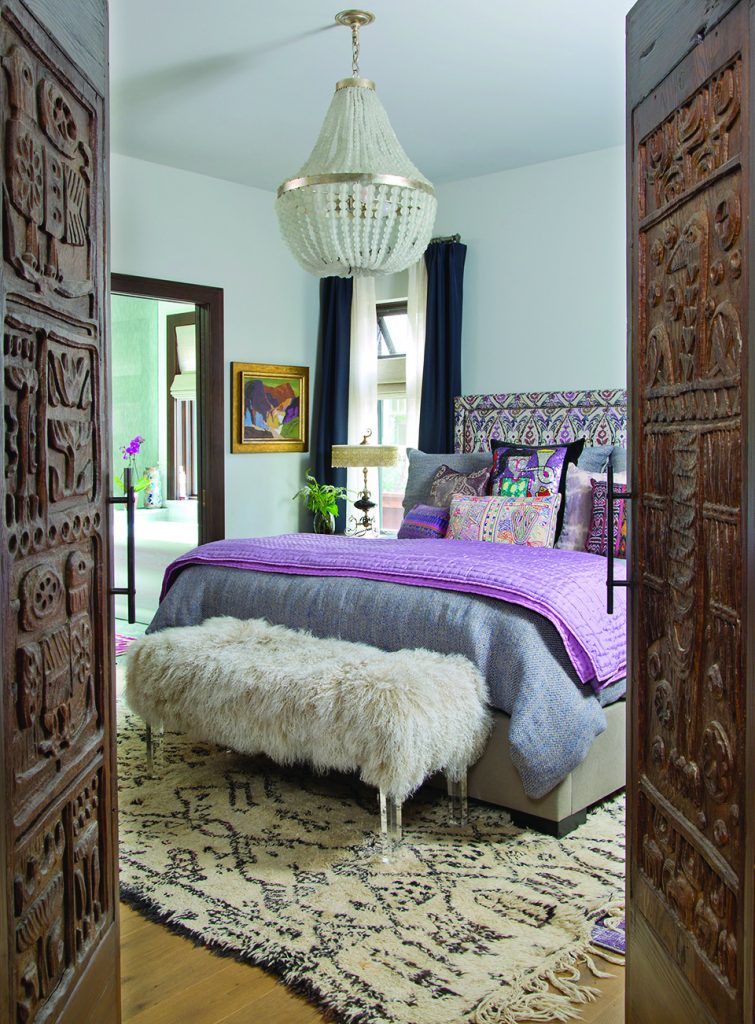
This client was an art curator with impeccable taste, Rundiks says. The exquisitely embroidered headboard was one of the driving factors in the design. “There are so many colors in the headboard and everything plays off that,” she says. The headboard pulls in the navy curtains and white drapery, “giving you a breath of fresh air.” The stool provides texture and the carpet’s open, loosely organized pattern is simple and organic. “That openness offsets the headboard,” Rundiks says. Colors in the wall art, pillows and bedding tie in to the headboard as well. The pattern in the wood doors ties in to the carpet pattern, but the door’s solid color gives the eye a resting place.  
Photo by Heather Burns Knierim, HBKPhotography.com

Putting Patterns Together

Here are designer tips for picking patterns for a room. 1. Choose a favorite thing you’d like to highlight in a room. This could be a furnishing, an art piece, a rug or even a color. 2. Pick a color palette you like and then choose colors with similar hues for your patterns (but don’t mix white patterns with off-white patterns). 3. Choose three patterns to combine with your favorite thing. The trick is to contrast the scale of these patterns, from large to small. The first pattern should be your largest-scale pattern, which could have many colors. The second pattern should be very different from your first, and half the scale, but still have some of the colors in your first pattern. Your third pattern can be similar to either your first or second pattern, but it should be the smallest scale and contain the fewest colors. 4. Consider textures. Do you want casual (think cotton) or traditional (think damask) fabrics and textures? 5. Keep it balanced. Spread patterns, textures and colors throughout the décor to avoid giving too much weight to any particular area of the room. 6. Give the eye places to rest, whether they’re white walls, solid furnishings or single-colored items.  
Photo by Susie Brenner, SBrennerPhoto.com
Originally, only the sofa and rug existed here. “So the first thing we did was to choose a contrasting color, which was the blue,” Rundik says. The blues and creams drove the rest of the project. The orange painting and pillow pull the sofa back into the design, and metal detailing in the tables and lamps ties everything together. If you look closely, you’ll see gold banding on the side table, gold trim on the marble lamp, gold ribbons in the lamp on the blue cabinet, gold nailheads on the cabinet and a gold metal table in the middle  
Photo by Heather Burns Knierim, HBKPhotography.com
The plain leather ottoman and cement planters contrast nicely with the red and teal colors and patterns in the Moroccan floor cushion and the Persian rug. “The art adds another quieter, modern layer of pattern to the space,” says the interior designer, Jennifer Rhode. To prevent the overlap of contrasting colors and patterns, Rhode pushed the ottomans against the wall. The floor, she says, gives the eye a break before it takes in the patterns of the ottomans and wall art. “The contemporary painting ties the modern and traditional accents together, which I love. That brings a nice surprise that makes sense there.”  
Photo by Emily Minton Redfield, emredfieldphotography.com
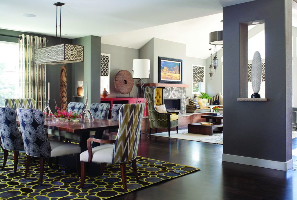
These rooms feature an array of patterns and scale. “The key to having a lot of diverse patterns in your project is scale,” Rundiks says, so that you have large, medium and small scales of patterns. “In this design, the shapes and patterns are so diametrically opposed that they support each other,” she notes. A simple color palette of black, olive, gray, ivory and rust tones down the patterns. The rug just has two colors and is made out of cut cowhide, which is very natural and soft. Plain and textural pieces are also essential. The wood in the dining room table and floor offers the eye a break from patterns, while the living room carpet adds an open and soft touch.  
Photo by Emily Minton Redfield, emredfieldphotography.com
A leaf-patterned entry table anchors this foyer, while Prussian blue ties together the décor, from the patterned rug and statue pedestal to the artwork.  
Photo by Emily Minton Redfield, emredfieldphotography.com
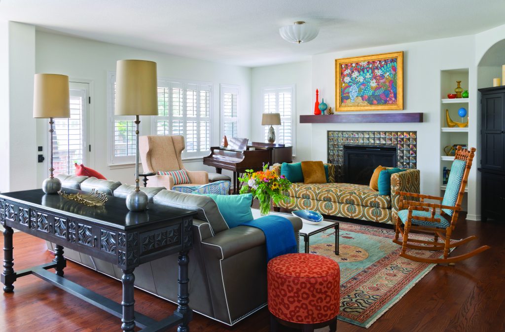
The white background in this living room offsets the rich patterns in the daybed, rug, ottoman, artwork and fireplace trim. The white is “low-key and allows all the pretty patterns to stand out,” Rundiks says. A traditional rug complements the contemporary furniture, while the patterned but solid-colored sofa table is a strong element that lets the eye rest. The warm orange colors in the daybed and ottoman are similar, which ties them together. While the ottoman is traditional, it’s also very organic. “The daybed is busier because it has a repetitive pattern that’s uniform. That makes it very strong to the eye,” Rundiks says.
Prev Post 6 Ways to Repurpose China
Next Post Eco-Conscious Home Goods
Browns Shoe Fit
Wild Animal Sanctuary