Show Your Colors – Using the Color Wheel in Your Garden

06 Apr 2015

show-colors-Color-Wheel
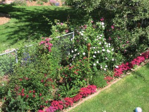
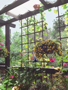
The color wheel is a good tool for helping you pick colors for your garden.

Kim Keech’s container garden uses colors and textures to create a dazzling potted display.
By Arna Cohen The world is full of spectacular gardens: Pierre du Pont’s sprawling Longwood Gardens in Pennsylvania. Frederick Law Olmsted’s Biltmore Gardens in North Carolina. British Columbia’s magnificent Butchart Gardens. And then there’s Versailles, the crown jewel of gardens. What stands out about these gardens is vignettes of pink, purple and magenta azaleas spilling down a hillside in an arboretum; canary-yellow dahlias poised against a stone wall; a plot of only pink-and-green striped tulips; purple hyacinths tucked between swaths of yellow tulips. None of these scenes are accidental, of course. All are created with thoughtful consideration of color, setting and perspective. If you want to create an irresistibly colorful garden, start with the color wheel. When you understand how colors relate to each other, you can fashion an Asian retreat, a fiesta in a pot, a multicolored meadow or whatever else you desire.
Kim Keech’s small patio is awash in potted plants, contrasts and textures, from spiky and speckled to smooth and bumpy. She prefers pots filled with warm-toned plants because “if the plants are bright and colorful, it just makes me happy.”
Our knowledge of the color wheel usually begins in nursery school, where we’re introduced to finger painting. The teacher gives us yellow, red and blue paints—the primary colors that are the foundation for all colors. Mixing two colors results in the secondary colors: violet (a combination of red and blue), green (yellow and blue) and orange (yellow and red). Blending a secondary color with a primary color creates the tertiary colors: yellow-orange, red-violet, blue-green, yellow-green, and so on. Adding white or black creates lighter and darker shades. But how does the color wheel translate to the garden? “The color wheel is a good guideline,” says Thad Napp of Napp Landscape Services in Longmont. Analogous colors sit next to or near each other on the color wheel—red-orange-yellow, yellow-green-blue, violet-red-orange and so on. Analogous shades mix easily and harmoniously in the garden, he says. For dramatic contrasts, use a complementary palette, which combines colors that sit opposite each other on the color wheel. For example, blue delphiniums would complement orange lilies, purple liatris would highlight golden black-eyed Susans, and lime-green heuchera would pop against red coleus. And though white isn’t on the color wheel, it exists in nature. Use white to brighten shady spots, tone down intense colors and separate bold colors that vie for attention. But perhaps you love purple, and only purple. You’d be very happy with a monochromatic palette—a variety of plants in a single color of varying shades, which can be very hip, Napp says. People with all-white “moon” gardens love their elegance and the glow the flowers take on as dusk approaches. And a white garden is something to consider if most of your garden hours are limited to evenings after work. However, without diversity of color to hold the eye, “you have to be a really good gardener to make a monochromatic garden interesting,” says longtime Boulder gardener Mary Lynn Bruny. “You have to add a lot of texture and foliage to really make it pop.” And to her, ruling out all the other color possibilities is a very difficult choice. “I’d have a hard time not having them,” she says. [pp_gallery gallery_id="11095" width="150" height="150"] Photos above: Analogous color palette, monochromatic palette, complementary colors, cool colors, warm colors, foliage variations (last two photos).

Hot and Cold

Bruny likes to plant analogous palettes of purples and pinks, exemplified by her peonies, geraniums, delphiniums and roses.
Colors also have temperatures. Cool blues, greens and purples impart a sense of peace and serenity. Warm yellows, reds and oranges buzz with energy. Warm colors jump out at you and are great for highlighting features, like a sculpture or a decorative bench, or somewhere you want the eye to go. Cool colors recede and are perfect for creating depth in a bed or to make a small garden look larger. Bruny likes to plant cool purple and blue shades because Colorado summers are so hot. She combines these with analogous colors of wine and burgundy, and complements them all with yellows. Bearded iris in purples and whites in a yellow-blossomed ground cover bordered one walkway at her former Boulder County home, followed by blue delphiniums later in the season. A shrub with dark-crimson foliage added extra punch.
Mary Lynn Bruny’s spring garden bursts with the cool tones of bearded iris, hardy geranium, lamb’s ear, catmint and barberry peony.
Kim Keech, Bruny’s friend and fellow gardener, prefers the opposite slice of the color wheel. Her garden is on a second-story deck that opens out from her living room. Each year she fills terra-cotta pots and hanging baskets with a riot of green, red, yellow, gold, fuchsia and orange. “I’ve always wanted to try the calm and serene theme, but it just never works out that way,” Keech says. “If the plants are bright and colorful, it just makes me happy—and I’m the one who takes care of them.” Keech says the foundation for each pot is a vibrantly colored geranium joined by annuals in a mix of warm and bright colors. Tall, spiky green foliage springs up in back for texture, while softer petunias or lobelias trail over the front. “I try to plant each pot so it can stand alone, but also be a part of the whole color scheme,” Keech says.

Paint with Pride

Bruny’s fence garden sports clematis blooms in shades of pink and purple, red and pink roses, purple lavender and hot-pink dianthus.
When adding color to a garden, paint with a big brush, Napp says. “People try to put pieces of color in a lot of spots and sometimes that gets lost.” Small patches of color can work in a seating area where you’re right on top of the plantings. Otherwise, large swaths of color have the most impact for long and middle views. For areas at a distance, make a splash with larger blossoms like peonies, hydrangeas and sunflowers, or multiflowered sprays such as delphiniums, snapdragons and goldenrod. For closer areas, try planting swaths of colors, perhaps blue flowers next to red and white swaths, using plants of similar heights. Just as you consider personal skin tone and eye and hair color when buying clothes, consider your home’s color and hardscape when choosing color schemes. Much as Bruny loves purples and blues, she found they didn’t work well when she lived on a property with a red barn. “I veered into a lot of the warmer colors,” she says, “but I needed really deep, bright colors to show up” against the barn. Conversely, you might have a bare neutral wall that could be perfect for colorful sprays of climbing rosebushes.
Her shade garden relies on varied leaf textures for interest, including ‘Sem False’ spirea, which is three-toned in spring with pink, yellow and green leaves; purple sedum; yellow ‘Circus’ heuchera leaves with purple veins; white dead nettle; orange ‘Melton Fire’ potentilla; yellow cabbage; purple iris; green-and-yellow-leaved hostas; and pink bleeding hearts.
Colors perform differently in sun and shade, so consider your planting spot. Is it shady most of the day or in the sun? Deep, vibrant shades that catch fire in full sun will look dark and dull in shade. And pale hues that light a shady corner can look washed out in sunlight. Foliage is to flowers what black velvet is to diamonds: It enhances their sparkle and color. But foliage can be a design element in and of itself. Think solid, speckled, striped, variegated, fat, skinny, smooth, bumpy, etc., to create contrast and layers. Add extra color with glossy urns, painted benches, weathered sculptures, whatever catches your fancy. Keech plays up the fiesta atmosphere on her deck with Chinese lanterns, paper stars, strings of lights, garlands of fans and artifacts from her travels.
Bruny plants for fall color as well, with ‘Autumn Blaze’ maples at the rear of this path, columnar yellow-leaved buckthorns along the fence, and ‘Carol Macky’ daphnes, viburnum, Japanese maple and yellow peony to the left of the path. The ‘Rockspray’ cotoneaster on the right has handsome red berries in fall.
Wandering through a nursery can be overwhelming and we sometimes leave with a bunch of plants that just don’t go together. It’s a common mistake, says Mike Woods of J&S Landscape in Boulder. “Try to control the variety of plants you buy,” he says. “A good rule of thumb is three or so of one type of plant.” Create repetition by planting these same plants in different locations so the eye will see them throughout the garden, giving the space a cohesive feel. Plan for color in all seasons by planting a succession of spring, summer and fall bloomers. Think pinks, purples and blues in spring, fiery reds and yellows in summer, and soft oranges and golden hues in fall. Then stand back and color me impressed!
Prev Post 6 Ways to Repurpose China
Next Post Fracking Facts
Browns Shoe Fit
Wild Animal Sanctuary