The Modern (Not Massive) Ranch
02 Mar 2011
This ranch home went from dark and gloomy to chic and airy, without overwhelming the neighborhood’s character in the process.
By Juana Gómez For 25 years, a photo of Julie and Tim Herrin sat on a shelf in their former home’s dark basement office. Tim had just finished a race, bike in one arm and Julie in the other. Taken in filtered sunlight, the photo shows the couple gazing lovingly at each other.
- Photos by Image Engineer; Before Photo by Lawrence and Gómez Architects

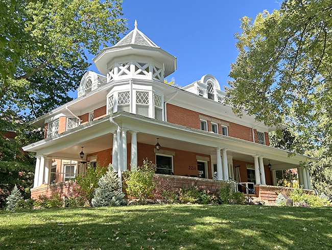
- Before renovation, this ranch home’s dark entry was tucked out of view. After renovation, the cheerier façade lets in light, views and visitors.

- Before; The front of the home was extended outward to create a new home office.

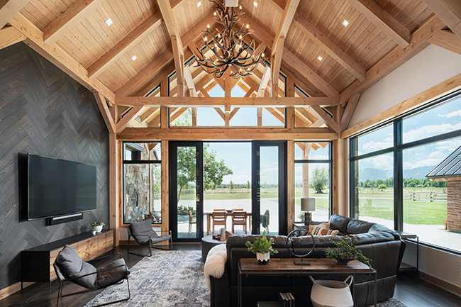
- The new, taller ceiling unified the living-dining-kitchen area after partitions were eliminated between the former rooms. Carving space from the attic to create the ceiling’s hip shape—highlighted by trim—turned up the volume in this now-open portion of the home.

- Before; living-dining-kitchen area
Keen Craftsmanship
The Herrins interviewed several contractors and chose Boulder’s Cottonwood Custom Builders for the remodel. “We had the most confidence that [owner] Jeff Hindman had a good balance between cost and quality,” Tim says. “Plus, he was conscious of the remodel’s environmental impact.” Hindman was attracted to the project because of the emphasis on workmanship, including adequate insulation, indoor air quality, weatherproofing and natural light. But he did encounter challenges: “There was no framing behind the basement drywall in the original house, so we did significant extra work to bring the building up to the current standards for energy efficiency,” Hindman says. Throughout the seven-month construction phase, the architect, contractor and homeowners communicated at least daily. Consequently, Julie and Tim have few regrets, and most concern small deletions they made to stay within budget, “like eliminating radiant heat in the floor of the boys’ bath,” says Julie, noting that the big-budget decisions were made well in advance during the drawing stages.
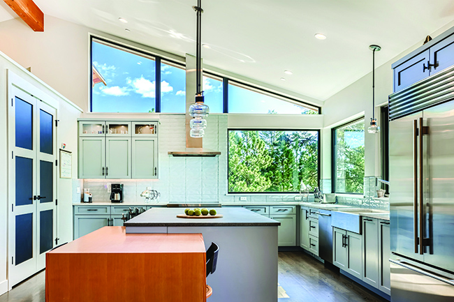
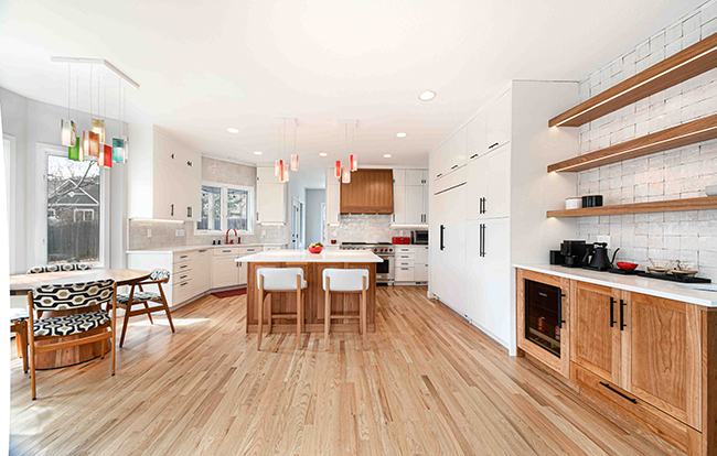
- Cherry cabinets and stainless steel provide a nice modern contrast to the kitchen’s leather-finish countertops with chiseled edges.

- Before; kitchen