Painting Pointers
12 Jan 2015
 Picking room colors doesn’t have to be daunting. Here are basic tips from a painting pro.
By Deirdre Christen
Color is a key interior-design element and instrumental to personalizing your space. But choosing color causes anxiety and poses a challenge for many.
In Design with Color: A Sunset Design Guide, architect John Lum notes, “There’s a lot of mystique around color…but I don’t think it takes an expert to understand color.” Home-owners can create spaces they’ll love if they carefully consider their preferences before painting.
- Pale blues and yellows create a serene sitting area in this master bedroom.

- This coral dining room uses many painting techniques to create a welcoming space. Painting the cabinetry a muted color that’s different from the walls adds interest and balance. Using multiple shades of coral accentuates the room’s architecture, and a glaze over the deepest coral color adds a textural element while softening the room’s overall appearance.
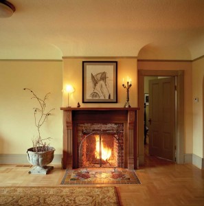
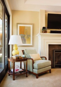
- Warm gold in two shades draws your eye to the beautiful fireplace, and highlights the wonderful coved ceiling. Using beige for the moldings keeps them neutral, but adds a warmth to the room that a white trim wouldn’t.

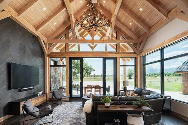
- Painting the built-in bookcases green creates an interesting focal point in this room, which complements the wooden ceiling. The overall color scheme is very neutral, so adding pops of saturated green helps to anchor the smaller seating area within this much larger room.
Color Tricks

- Blue makes a soothing statement in this powder room without overpowering the space.

- Beachy sand and surf tones create naturally soothing harmony in these rooms, cleanly accented by white trim.
Prep Work
Proper preparation is frequently overlooked, but it’s crucial to good results when painting. For instance, making sure the surface to be painted is clean is as important as choosing the “right” color. Also, protect adjacent surfaces by masking them with painter’s tape and use drop cloths. When covering a color drastically different from your new one, use a white or tinted primer to keep the previous wall color from showing through. And though it seems obvious, reading and following manufacturer’s instructions is key to using products correctly. The makers of Yolo Colorhouse point out, “Color is consistent in only one thing: It is ever changing. Light, space and other colors in proximity constantly change how color is viewed.”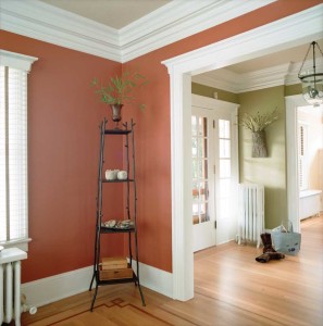
- These entry and corner spaces boast strong wall colors that contrast nicely with the crisp white trim. Painting the ceilings a third color adds warmth, and directs the eye to the detailed ceiling trim. Using different wall colors defines each space as separate, but using the same ceiling and trim colors provides continuity.
Painting Resources
Check these books and website for more colorful ideas: Perfect Neutrals: Color You Can Live With by Stephanie Hoppen (Watson-Guptill, New York, 2006) Design with Color: A Sunset Design Guide by Karen Templer (Sunset, Menlo Park, Calif., 2009) www.benjaminmoore.com. Click on the “Personal Color Viewer” tab to play around with different colors in various rooms to see the palettes you’re attracted to (it’s fun!).Deirdre Christen works for Casa Verde Paint in Denver.